Tuesday, 26 October 2010

Sketchbook Workshop

The idea of this workshop, was to get us to understand why we use sketchbooks and what we use them for.

So why use a sketchbook?
I use a sketchbook to document all my ideas. Also to show my development, almost like a story for my work, the stages leading up to my resolved piece. I also use a sketchbook to help people to understand my ideas and to help them understand where they have came from and how they got to the place where they are meant to be. I also use a sketchbook to write down research I have done on the topics I am focusing on.

The task for this workshop was; Divide into groups of 4,use the A4 sketchbook provided record information inspired by the LCC 5 main resource areas:
  1. Letterpress
  2. Design Photography
  3. Printmaking
  4. Open Access Computing W101
  5. 3D Workshop
You will have to agree what goes in and how to communicate your intentions.

This is a drawing of an apple mac from open access computing room W101

This is one of the silkscreen machine from the printmaking room


This is one of the lights from the design photography studio

This is some letterpress that i done in the letterpress studio 


This was a mistake that happened when doing the letterpress, but I think it has come out looking interesting.


Monday, 25 October 2010

Idea Workshop.

The idea of the 'Idea' Workshop was to get us to start thinking of different ways to produce ideas. Here is a list of things that we was given to consider.
  • Consider all factors (Brain storm)
  • Dominant idea (What idea you had more ideas for)
  • Concept challenge (Reverse, Exaggerate, Distort, Wishful hunting)    
  • Stepping stone (How one thing can lead on to another)
  • Random input (etc...Animals testing on humans?)
From this we were given a group task which was;
  • Out come: Website
  • Client: Eco-charity
  • Target audience: Housewives
  •  Message: Buy less
For this we started of with a brain storm listing all the ways that you could save money and help to save the planet.

First Brainstorm.
From this brain storm we chose the most dominant idea which was animal testing. We then started to produce another brain storm for our dominant idea, listing ways in which we could link animal testing into try to trying to make housewives buy less.


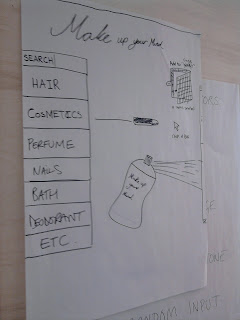
One idea we came up with was to try and put them off from buying make-up, by showing them that make-up is tested on animals.We then started to draw out our web page and how it would be layed out and how it will work. What we aimed to do was to design a web site that looks like a site that sells make-up but when you click on the item to buy it, it comes up with a photography of an animal which has been tested on with the product you was going to buy.


A quick drawing of how we wanted our web page to look.
The next task was on the same lines as the first task.The task was:
  • Global sports ware company
  • Target audience: 20+ year old design students
  • Message: Buy more
  • Out come: TV advert
Once again we started with a brainstorm listing all the ideas we could think of to do with sports ware.


We then chose the most dominant idea which was customizing your own sportswear and created another brainstorm based on customizing and all the items you could customize.


We wrote down all of the things that could be customized from sports bags to trainers. But the most dominant idea from the brainstorm was skateboard customizing. And once again we made another brainstorm which consited of all the different advert ideas e.g. people coming together and painting a giant skateboard which comes to life when it finished and skates all over London.


We then done some mock up drawings of how we wanted the advert to look like, some hand drawn screen shots that went through step by step of how the advert would run. We also put a power point together to present back to the group of how we came to our final decision and the paths we took to get there.

Letter Press Workshop


Letter press workshop, here are some photographs taken from the letterpress workshop.The photograph on the left is the typeface we chose which was castellar; Based on carved lettering on a Roman column dedicated to Augustus, and named after a town in the Alps, and is only avliable in capital letters.
And the photograph on the right is the layout we have chosen to do, we decided to layout the letters in the shape of mountains to link it back to what it was named after.

Typo Workshop

Typoggraphy;
  • The architecture of ideas and the making of languge.
  • The suculpting of experenice.
  • The manegment of letters.
  • Painting with words.
Typography is the means by which an idea is written and given visual form.


Different cultures layout their typography in different ways;

1)Latian, 2)Arabic, 3)Chinese, 4)Greek.
When writen/reading in latian you read from left to right this is widely used acrossed the world. When writeing/reading in arabic you do so from right to left. When writing/reading in chinese you would do so for up to down. And last, when writing/reading in greek you would do so from right to left and then left to right.

The first task; do you need punctuation? the task was to remove all the punctuation from this sentience; Typophilia: An excessive attachment to and fascination with the shape of often intrests, and object choices.Typophiliacs usually die penniless and alone. What I done was I cut out all the words and the punctuation and then placed them out again but without the punctuation in it to see how the sentience would flow. I agreed that punctuation is needed as it brings order to the words you are reading, it also puts expression in to a sentience and sets a pace to what you are reading.
The sentience.

The next task was to chose a font and from that font chose a letter, I chose the letter 'B', from this I was given a sheet which had 7 boxes on it with the words; Scale, Invert, Section, Layer, Outline, Desconstruct and recompose. Working from these words I had to edit the letter I chose so that it fits in with the word that where writen under the box. 

The third and final task was to choose one of the following words; Hard, Soft, UP, Down, Increase, Decrease, Masculine, Feminine. I chose the word 'Hard', and with this word I had to attempt to edit the letterforms to arrive at engaging outcomes; Texture, Colour, Scale, Composition, Repetition, Reduction, Order and Reflection. I used the sheet that was provided to help me do this task.

Monday, 18 October 2010

Out and About.

Out and about, we went to old street to visit some gallery's.


I really like the different Styles of Work that i saw when out and about, from simple line images to bold and brightly coloured images. This has given me a wider idea of different styles and ways that i can produce work and the different ways that i could lay them out.

Image workshop.

The first part of this workshop was to define the word draw. my definition of the word draw was: to illustrate, to produce images using different types of media, to make a make on a surface, e.g pen, pencil,chalk ect.
The second task was to draw an object that we had on us, i decided to draw my set of keys, the idea of this task was to see how we draw, the different styles and media we use.

My drawing of keys.

The next task was to draw an object without looking down at the paper you are drawing on, The idea of this task was to try and make us better drawers, focusing on the object we are drawing more, rather then the drawing its self, because if you focus on what you are drawing more then the image you are drawing the out come should look better as you are not putting details in that are not there. I then had to draw the same object in the same way but using my left hand, to also see how the drawing would come out.

Right hand.

Left hand.
The next task was taken from Air Made Visible, The task was to make our own forms and design of an oak leaf, tracing the: outline, principal nerve system, external points and internal points. Once I had traced these points I had several different structures of the oak leaf.


Oak leaf tracings.
The final task of the day was Collage. We was given a list of themes that we could work from:
  • Composition
  • Editing
  • Contrast
  • Rhythm
  • Texture
  • Re purposing
  • Juxtaposition
  • Surrealism
  • Narrative
  • Humor
From this list of themes I had to choose one theme, that i had to produce a collage to represent. The theme I chose was Humor.
The collage I produced to represent Humor.
The image above was the collage i produced to represent the word Humor, I chose a guy holding a fish as i that this was kind of random and did make me laugh, i then added the headphones to the image as well to make it even more unusual, to try and create more humor to the image. I also added the to red lined circles to the image with the word OK? the reason I put the word OK? in there was to add some sense of confusion to the image to try and make it more humorous.
I then was given the task of leaving more white space and using less images, I had to produce five more collages but not having to use the theme word but instead using one image for the first collage and two images for the second and so on, building up these collages trying to leave more white space.
My five collages.
From this workshop i feel that i have learnt that when drawing it is more important to focus on the object you are drawing rather then the drawing its self , because if you draw this way you focus less on the details that are not there, and hopefully produce a better drawing. Also that less can actually be more.

Monday, 11 October 2010

First Narrative Workshop

This day was split up into three task's. Task one was to select nine images and crop them to produce;
  • Close up of a detail
  • Wide angle vertical
  • Narrow angle vertical
  • Crop to abstract
  • Crop to define
  • Crop to enhance the emotional impact
  • Narrow vertical
  • Bold exciting
  • Discreet
Once we had manipulated the image's, we had to stick the before and after images to a sheet of A4 paper, and white tack them to the wall so that then group can compare and contrast the images that where produced.

Results of task one.
Task two was an individual task, The task was to create two narrative sequences from the list following:
  • Moment to moment
  • Action to action
  • Subject to subject
  • Scene to scene
  • Aspect to aspect
  • Non-sequitor
I was given a sequence sheet to help me produce my sequence's, the two sequence's I produced subject to subject and scene to scene. I belive that this workshop helped me get a better understanding of how to create a story through images, a narrative. I found this task harder then the first task as it was hard to find images that could be place together to create a narrative.


Results fro task two.


Task three was also an individual task. The task was to cut out all the images, headings and subheadings we could find left in the news papers, and take four of the images and apply random headings or subheadings to them to give the images a different meaning to produce different narrative's. From this task i learnt that just by adding text to an image you can completely change someones understanding of it, and to creating a whole different narrative for the image.


The images I cut out.

The heading's and subheading's I cut out.
Once I had produced my images I stuck them up on the wall with the other students work, so that we could compare and discuss how the meanings of the images had change due to adding the captions.

I feel that this work shop has helped me to under stand what a narrative is and how they can be used to help change the meanings of images or to help to produce a narrative without using text. I also feel that the information i have learnt from these task will help me in furter projects.

Thursday, 7 October 2010

First Posting

Getting To No My Surroundings.
This is one of several photographs that I took during one of the workshop activities on my first day at LCC, the idea of the work shop was to get to know the area that surrounds you, from the different textures to the smallest details in the fda design studio. The reason I choose this photograph is because I feel that it was one of the best photographs out of the selection, I like the contrast and the framing of the photograph, also the different textures you get from looking at it, the roughness of the small pieces of string that have been tied around the pipes, the ruggedness of the cracks in the wall behind it and also the sence of age from the dust and dirt that has settled on the pipes and the surrounding wall. I feel that this photograph is successful due to those qualities that i mentioned above.